
My Two Cents on the Cracker Barrel Controversy
Last month, the internet was talking all about the new Cracker Barrel logo and interior redesign for at least two weeks. At this point, it’s old news…but I love to take part in discussions about design, which this was….even though the “controversy” came to light through the lens of politics.
The new logo was announced in mid-August, and it pretty much broke the internet. The online right-wing and MAGA were seemingly outraged over the modernization of the brand, calling it “woke” and taking it as a personal attack on their identity. There is nothing political about it.
I became interested in the conversation because of the industry and line of work I am in. Graphic design is part of my full time profession and politics aside, I decided to share my opinions and criticisms on TikTok and Instagram as I am a working creative professional with a relevant bachelor’s degree. That, and I’m a bit of a nerd.
When you are looking to create a successful logo, several things should come to mind:
Less is more in terms of color and detail, especially if your brand is well-known
Is it scalable? Can it be printed really small and still be readable?
Can it be printed or translated to various media? Is it able to be embroidered and still be readable and legible? If detailed, can you decipher the detail?
If it is a redesign, are there any components that offer a nod to the brand’s legacy?
Is there anything clever about the logo like a hidden symbol or message? This point isn’t always necessary, but offers bonus points.
Before we get into my written analysis on the (former) new logo, let’s take a look at the logo’s history. Cracker Barrel was founded in 1969 as a southern country themed store and restaurant, which remains true to this day. However, the original logo is not the classic design that most of us are familiar with. The original logo is a simple typographical logo and looks nothing like any of the versions that would follow it. It uses a very western font, giving more “Wall Drug” vibes—a general store look, but fell short as nod to the southern region that inspired it.

Cracker Barrel Store, 1977 (Image credit: Cracker Barrel)

Image via Logos-World
In 1977, the logo was changed to a format that stuck around for decades and is the design we are most familiar with: The lettering was changed to a very swooping, playful, bold font where certrain characters interlaced with each other and with the border of the “bean” shape the CRACKER BARREL words were grounded in. Next to the lettering, a rather detailed figure of an older man named “Uncle Herschel” leaning on a barrel was added. Until this year, though it went through a few refreshes over 47 years, Uncle Herschel, the barrel, and the unique lettering remained consistent.
Now, I do not know what Cracker Barrel’s business looks like on a regular day, but every time I’ve passed by one in recent years, the parking lot is still mostly full. As I write this, I have not been in many, many years. I would expect that the last time I went, I was in middle school or high school. I only ever went to Cracker Barrel with my maternal grandparents. I got the “Eg-No-Ra-Moose” game (If you know, you know) in my stocking for Christmas one year, as did the other grandkids. My grandparents are what I associate my nostalgia for the brand with, and I am sure that is the case with many other Americans.
But nonetheless, the brand decided it was time for a face lift, as all longstanding brands do in order to try to stay relevant and cut costs. What we got, was a very minimalist version of the “Cracker Barrel” text.
In this new version, the font is a bold yet simple sans-serif, and the C & B still interact with each other. The rusty brown was changed to a soft black, and the text placed within a “Cracker Barrel yellow” shape that is supposed to be a barrel on it’s side.
Now, I don’t hate the logo. I would give it a 6.5-7/10. This new version, while I think could be refined (but we will get to that), keeps subtle notes of the brand’s legacy but is scalable and more flexible in terms of how it can be rendered. You couldn’t shrink Uncle Herschel down without losing detail. You couldn’t embroider Uncle Herschel on a hat and retain the details successfully. Scalability and contrast is important with a logo. If redesigning a logo was your project for Design school, the designer of this would get a passing grade for the accomplishing all the technical and objective asks of a logo.
Now, is the logo really minimal? Absolutely. Did the company pay thousands to millions of dollars for a redesign that looks like it could have been slapped together in Canva? Absolutely yes. This logo, to me, is not perfect—but that is always a matter of opinion, even if you hate it or not is simply an opinion. This absolutely could have gone further, and so I decided to tweak it and create my version for fun:
I kept the text the same, but retained the original brown used in the post 1977 logos. If you want to retain the rustic, antiquated character of the store—the rich, sepia-like brown still offers contrast but adds another layer to maintaining the brand’s legacy. The shape behind the new logo is what really bothers me. For one, it is too large. The logo does not need that much space, and could be shrunken down to interact with the text better. Also, I have learned that it is supposed to be a barrel shape. Um….it reads more like a belt buckle, badge, or a copycat of Denny’s. So I rounded out the top and bottom of the shape to make it more barrel-like, and here is what I would have delivered if I were the designer:

New CB logo, my version.
I’ve seen several graphic designers try their hand at their own versions of this logo, which was fun to see as they are all nerds like me. Some were similar to mine and just a refinement of the new logo, others tried to keep older components or were a completely new imagining. Love or hate the new logo, it is simply your opinion and that is okay.
But where Cracker Barrel really loses me is the interior of the restaurants being redesigned. Must everything become a sterile white and grey corporate-flavored box? Must we arrange the antiques on the wall like a modern art gallery? I want to walk into a cracker barrel and have it feel old, wooden, rustic, and nostalgic as if I really walked into a mom and pop general store from the 20th century or earlier. I want it to look like an antique store threw up in the dining room while I eat my eggs. I have no idea if they plan on continuing with renovating the actual stores since the internet exploded with the rebranding news, they had already renovated 25 stores prior to the announcement. They should leave it alone, of course, but there is a reason they might keep renovating but leave the logo in place….we will get to that later.
And I can agree that we don’t need to erase Uncle Herschel. People LOVE throwback merch, put him and the old logo on some T-shirts and whatnot. They would sell like hotcakes.
But at the end of the day, this was a corporate decision. The core of the brand’s demographic is in their 70’s and 80’s and are literally aging out of existence. The company took a risk to attract a younger crowd but also likely save money. Corporations have been doing this for all of existence, and never has it been an attack on culture and identity. There is nothing political about it. At the end of the day, we can share our opinions and move on. I have plans to go to a Cracker Barrel with some friends to just experience it before it is remodeled, and then I’ll just do what I’ve always done—forget it exists.
And we know now that the company very quickly changed course and is keeping Uncle Herschel. If we want to make this about politics….I wish society would get as big mad and proactive about real issues and not corporate logos….I still cannot wrap my brain around why so much of the US population is upset about THIS and not EVERYTHING ELSE that is very real and harmful in this timeline….but I digress…
Corporate logos can run like fashion—fit a trend and time, but always come back around. Take Pizza Hut, for example. The original red-roof logo was first created in 1974, and the roof of the brick-and-mortar buildings matched the red roof in the logo. But as you can see, this brand has reinvented itself to stay relevant its entire existence. The 1999 version—is VERY on-trend in terms of typography, treatment, and color of the turn of the millenium. It has a similar energy to the FRIENDS tv sitcom logo, in my opinion. Now, over the years we only PIVOTed (see what I did there since FRIENDS was mentioned?) slightly with simple refreshes. But, in the year 2025—people are loving throwbacks and nostalgia, and the brand returned to it’s original logo.
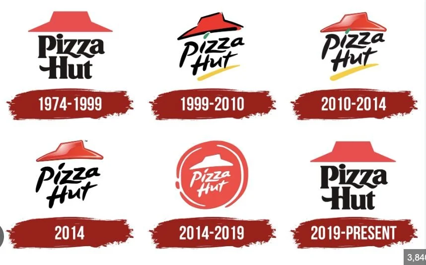
Image via Logos-World
Now, the company did not return to its original architecture. The red roof buildings are replaced with simpler storefronts that can be sold easier if a franchise or corporate location closes. I’ve seen many former Pizza Huts become other restaurants or businesses—and you can always look at it and know that it was once a pizza hut. If a location closes, another business might be less-inclined to purchase or lease the property if it looks too much like an old Pizza Hut. This might be the same case with Cracker Barrel renovations, but then again the facade of their stores still carries the old general store vibe, just with new paint.
Again, I have no idea if Cracker Barrel will continue to renovate its stores. If I were a decision maker here….purely for business reasons I’d leave the stores alone because 1) the audience is angry about it, not just the logo and 2) we are living in a time where people are craving nostalgia—especially millenials as our childhood was the last to experience the on-brand architecture pre-internet. Millenials could become the core demographic. Maybe the brand refresh is still inevitable, but they might have chosen the wrong time to do it.
I wonder what weird, pop culture thing a political faction will freak out over on the internet next?